Reflection
This was a project that taught me a lot about how different iterations can lead to many different ideas. Doing something a little bit on the artsier side made the site look like it was meant for a boutique rather than a city, so I had reduced focus on texture and illustration, and of course focused more on Rochester with an image instead.
After conducting my research, I discovered the complexity of the digital ID landscape. Many individuals do not possess social security cards to have digital ID's, and having different systems for digital identities in each state would create excessive complications. For digital IDs to be reliable, they must be universally recognized as valid means of identity verification, especially for travel and interstate activities.
Outdated Design:
Difficult to navigate and visually unappealing.Confusing Hierarchy:
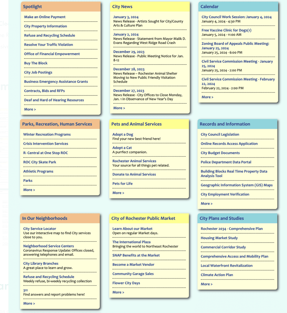
The site suffers from a confusing hierarchy that hinders users from easily finding the necessary information.Accessibility Issues:
Essential services, such as waste collection information, are not easily accessible to residents.
I established my goals to create functional navigation by sectioning and dividing information to enhance user scannability and ease of finding needed services, clarifying user flow, and utilizing familiar design patterns to reduce the learning curve. Additionally, I aimed for simplification by streamlining content and design to ensure a clutter-free and intuitive user experience.
OPPORTUNITIES
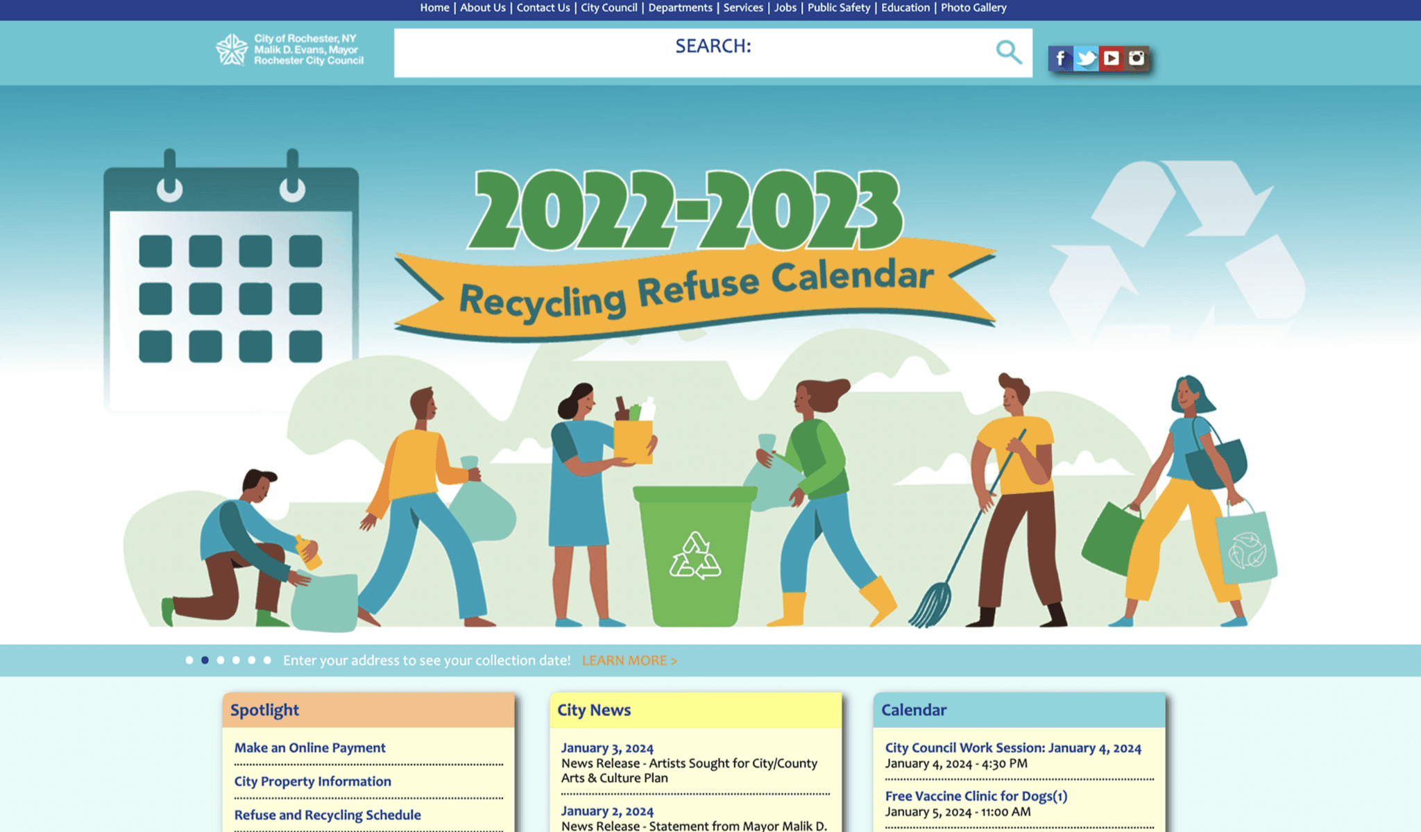
During a meeting with a Rochester City Council member, I discovered that the city website is eleven years old and had not been well-maintained. I quickly found problems to solve with this redesign when looking through the website:
Problem Scope
How can I redesign the outdated city website to enhance user experience by improving navigation, clarity, and accessibility, while maintaining the formal tone appropriate for a government site?
Many… Many Iterations and Experiments
I experimented with various methods of organizing information, including a wide assortment of cards and separators. I found that using cards made the information significantly easier to read compared to having it float.
Initially, I considered placing the navigation at the bottom for easy access, but I ultimately chose to position it on the left panel. This decision adds more visual interest and provides multiple ways for users to navigate to different screens.
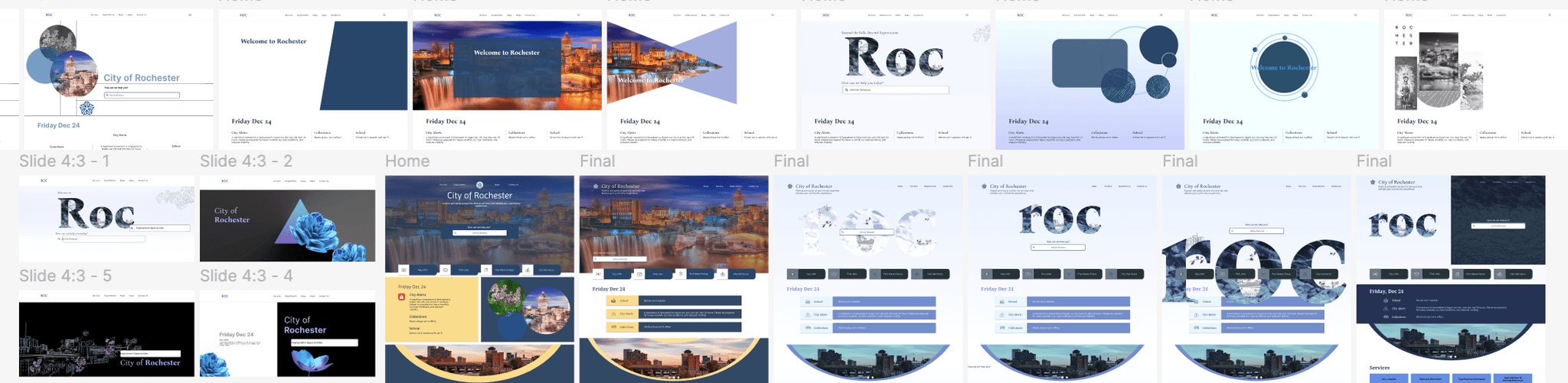
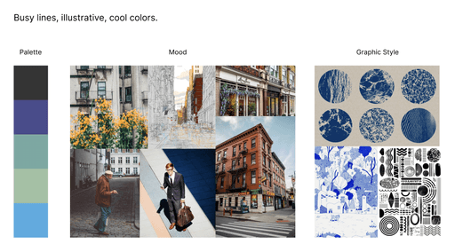
I created several moodboards to inspire my "Above the Fold" design. My favorite concept was a cool-toned illustrative route with texture and delicate illustrations. However, it didn't convey the formal tone I believe a government website should have. So, I continued iterating until I found a way to incorporate subtle details that balanced formality and aesthetic appeal.
I reviewed numerous city websites, analyzing their features to identify effective navigation tools that could significantly benefit Rochester's city website.
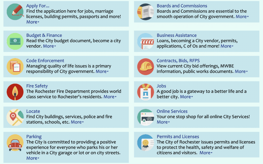
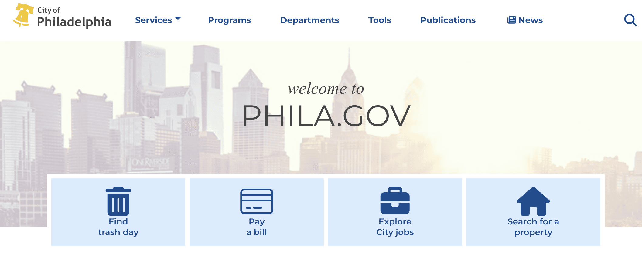
Philadelphia's government website features four large icons that provide easy access to frequently used services, reducing the time users spend searching for information.
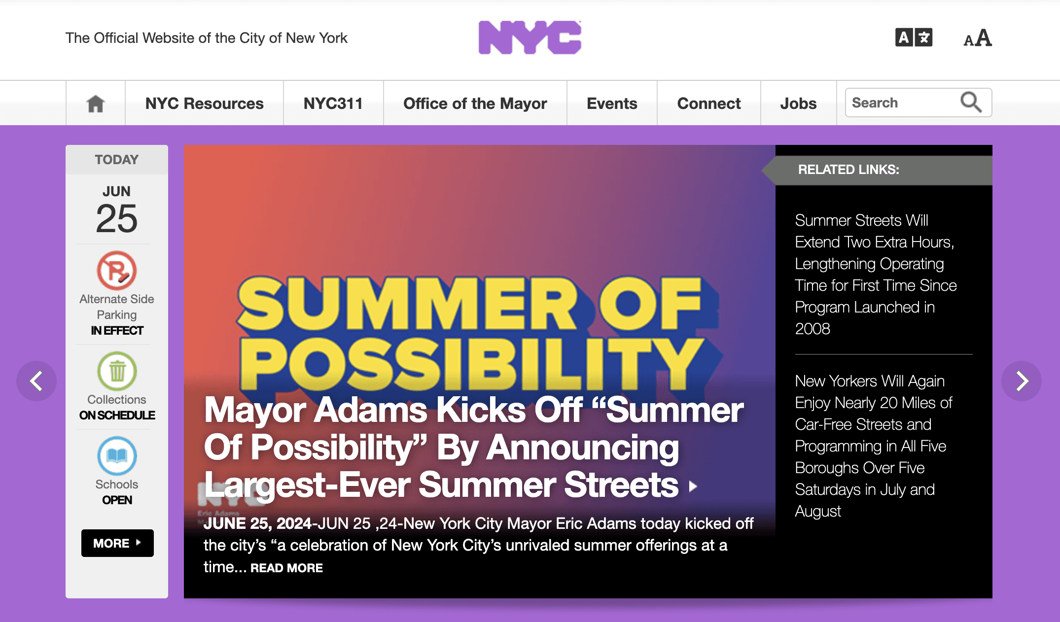
The NYC website's time-sensitive cards deliver real-time updates, including breaking news and weather delays, ensuring users can access critical information swiftly without navigating through multiple pages or menus, thereby streamlining the user experience.
Comparative Analysis
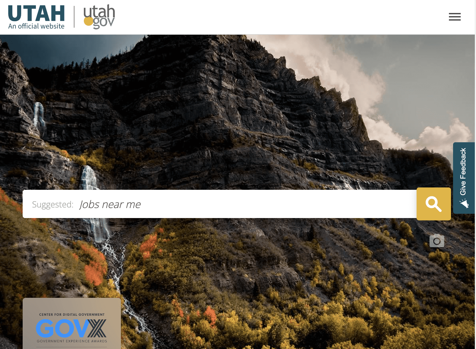
The search bar with rotating suggestions on Utah's government website enhances user focus on the search functionality, improving usability and guiding users to relevant information quickly.
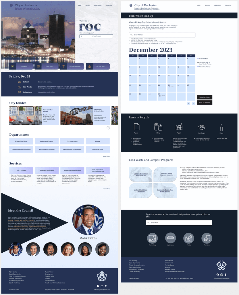
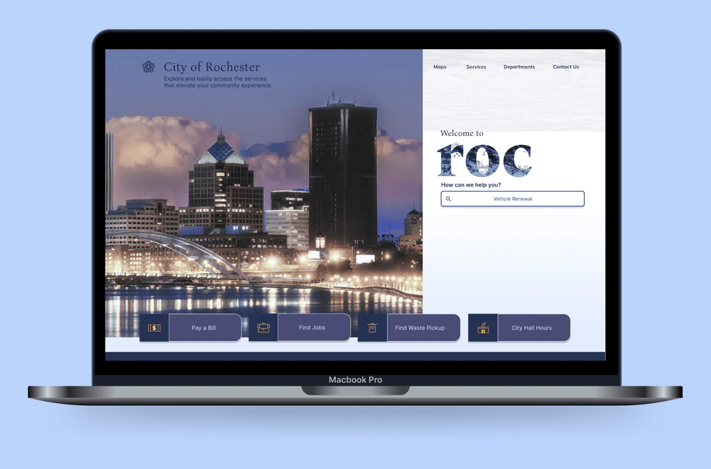
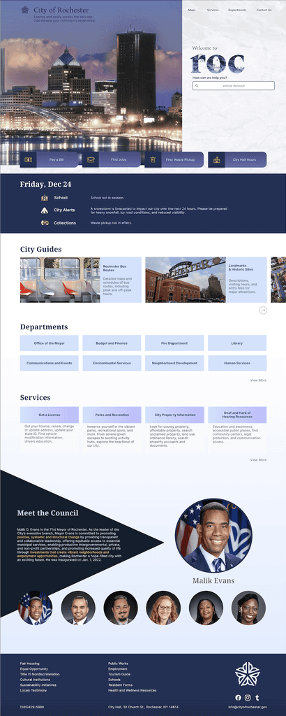
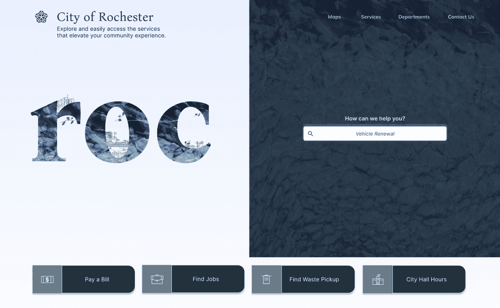
Final Product
A Reimagined Rochester Experience!
For the final design, I chose a more visually captivating approach, incorporating sophisticated elements. I added pops of purple and yellow, and used gradients throughout UI elements to introduce subtle dynamism and detail. This design captures the sophistication desired by the general audience while providing the functionality needed by the city's diverse demographic.
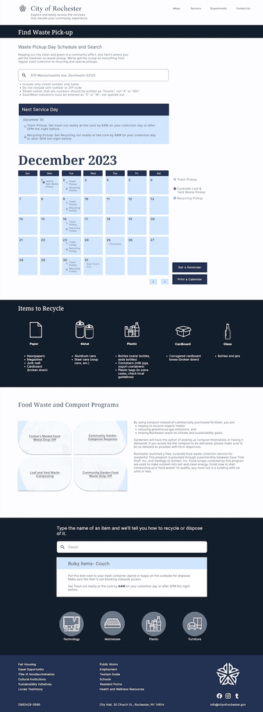
I completed the final page… and went a step further by adding an additional page to simplify the process of finding trash pickup routes for website users.
Context
The current municipal website for Rochester, NY, is over eleven years old and hard to navigate for users. I aimed to create a website to engage better, connect, and inform its users.
Residents, business owners, visitors, and others need to be able to access the site, conduct business with the city, and find answers to their inquiries effortlessly. The goal is to design a clutter-free, easy-to-navigate website that leaves a lasting positive impression on it’s visitors.
Role
Designer
Timeline
Nov- Dec 2023
A design that is clutter-free, easy to navigate, and leaves a positive impression on visitors.
Rochester City Website Redesign