Reflection
This was a project that taught me a lot about how different iterations can lead to many different ideas. Doing something a little bit on the artsier side made the site look like it was meant for a boutique rather than a city, so I had reduced focus on texture and illustration, and of course focused more on Rochester with an image instead.
After conducting my research, I discovered the complexity of the digital ID landscape. Many individuals do not possess social security cards to have digital ID's, and having different systems for digital identities in each state would create excessive complications. For digital IDs to be reliable, they must be universally recognized as valid means of identity verification, especially for travel and interstate activities.
OPPORTUNITIES
The current RIT website is lacking in areas like content organization, consistent style, and spacing. It’s distracting for it’s users and there is little readability. These were the points I chose to refine:
Visual Appeal
Content Hierarchy
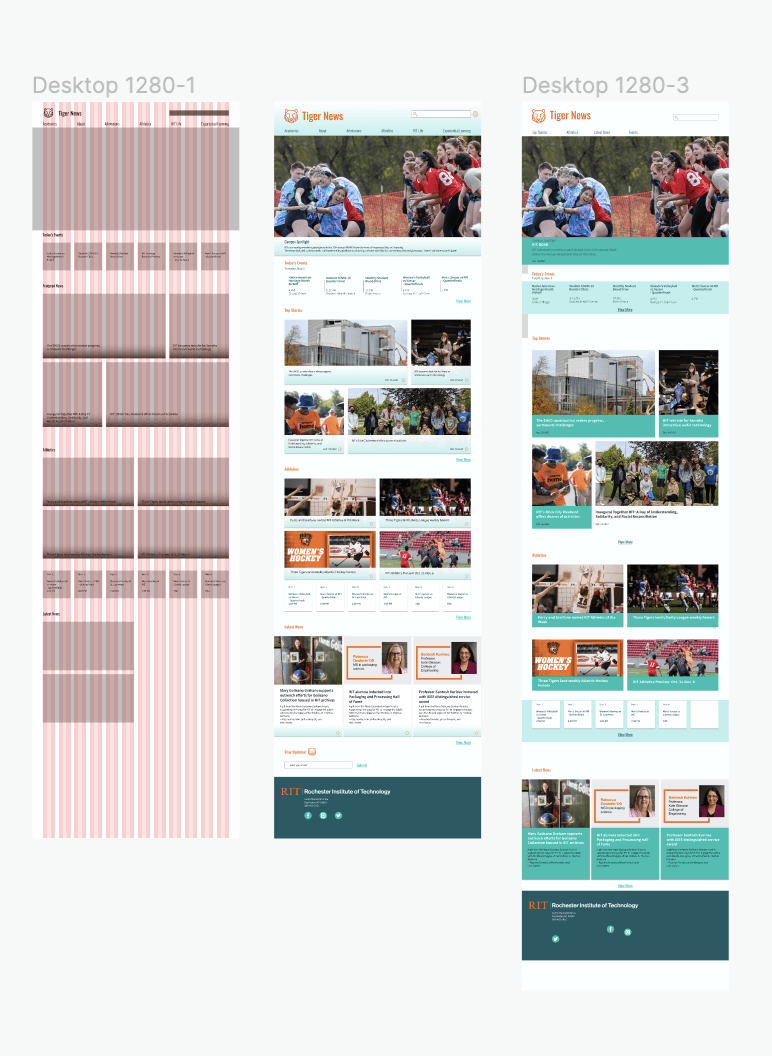
Grid Structure
3
2
1
1
Content Hierarchy
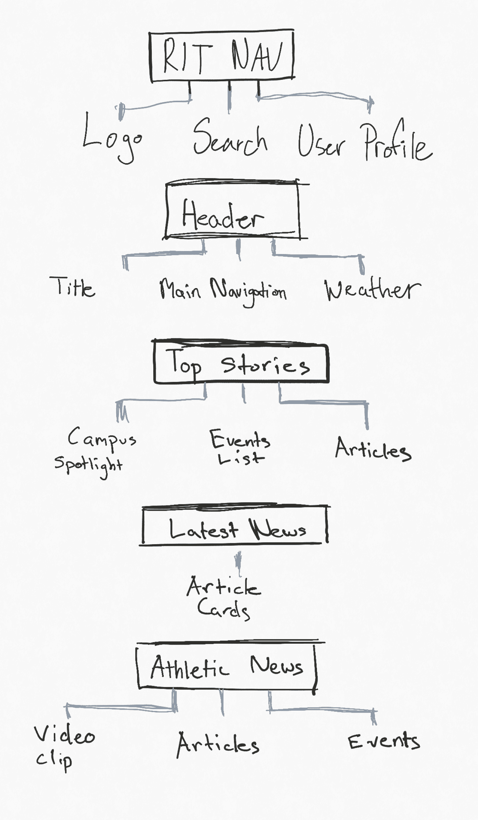
Devoloping this content hierarchy aids in navigation and wayfinding. Users who come to the RIT News site can intuitively follow the flow of information and know where to click or tap to access specific content or features.
Users often come to a website with a specific goal in mind, such as searching for information, products, or services. Having the search bar readily accessible at the top allows users to start their journey without having to scroll or navigate extensively.
The events list is early in the hierarchy near the “Campus Spotlight” because people often come to the site to look for events happening on campus.
2
Grid Structure
The grid I used to provide a framework for organizing RIT’s content in a visually consistent and harmonious way. Elements placed within a grid are aligned, which creates a sense of order and coherence across the website.
My early designs had good visual consistency, however the colors and style I experimented with were too distracting for the user to focus on the actual content.
3
Visual Appeal
Read More

View More
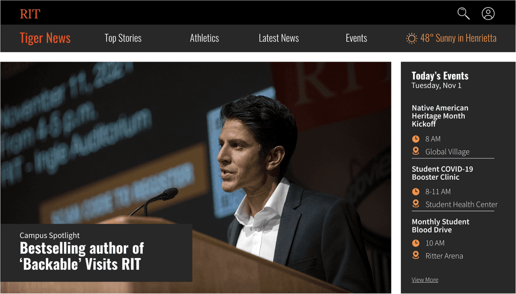
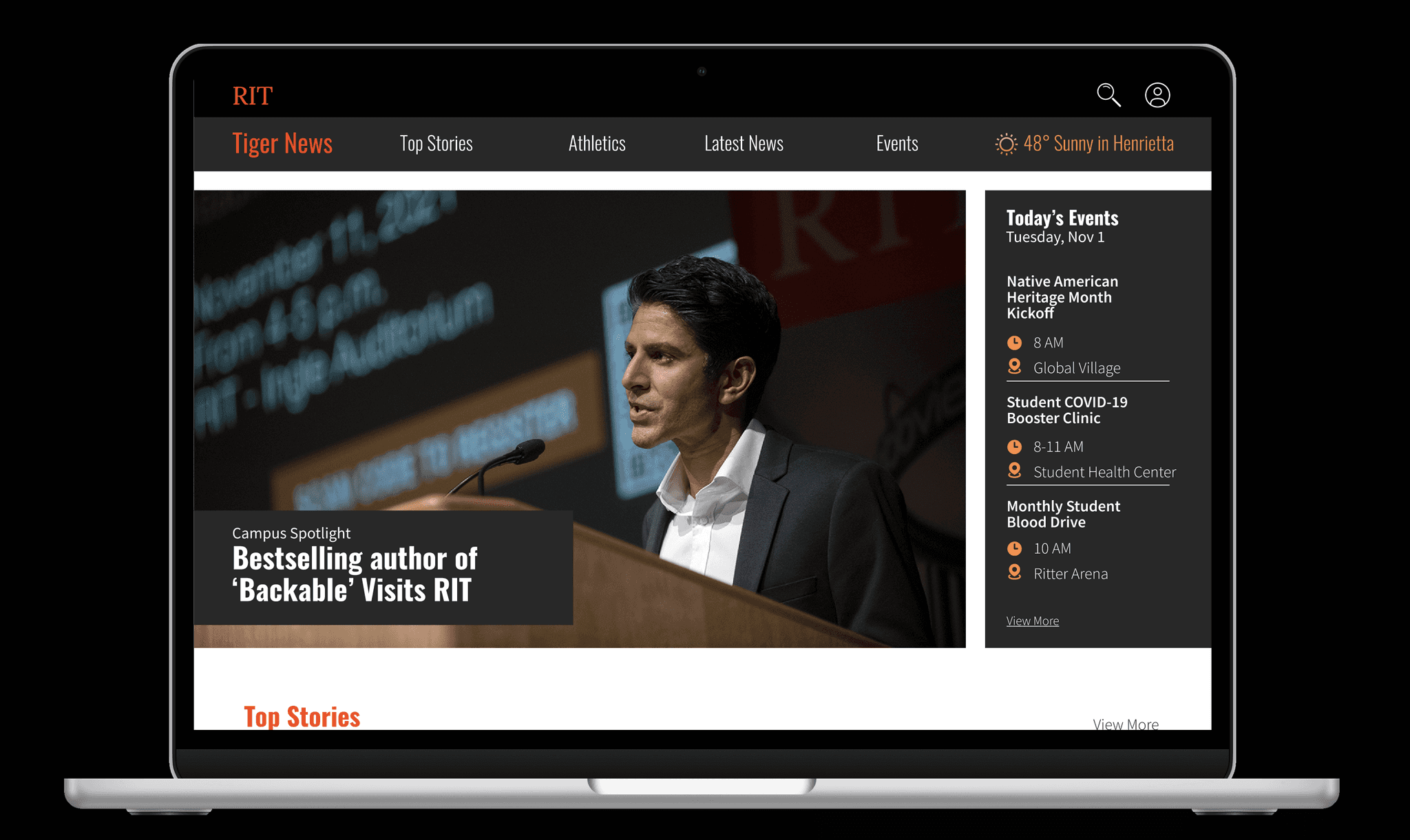
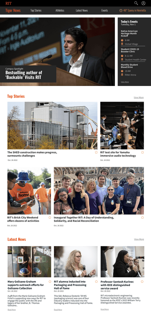
The features of my reskin contain sharp containers of information with orange accent colors to bring attention to important parts of the grouping.
Dark moody colors combined with a fiery shade of orange bring out a boldness in the site. Oswald, a geometric sans-serif font, gives a clean and modern look to the content.
Source Sans Pro - 20px, Bold
Source Sans Pro - 20px, Regular
#FD8C3B
#F76902
#FC440F
#B72900
Typography
Branding Colors
Oswald - 24px, Bold
Tiger News - 19px, Regular
Components
#282828
Many… Many Iterations and Experiments
Wireframes
1
Full Width Campus Spotlight
Serves as a platform to showcase the achievements, successes, and noteworthy events or activities happening on campus.
2
Events
Helps ensure that students, faculty, staff, alumni, and other stakeholders are well-informed about what is happening on campus.
3
Featured News
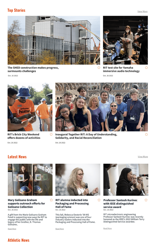
Showcase significant and timely information to the website's visitors. This can include major announcements, updates, and news stories
4
Athletics
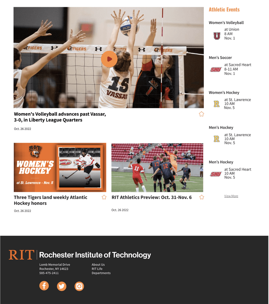
Engages the RIT community by keeping them informed about upcoming games, events, and activities related to sports.
5
Latest News
Provides visitors with the most current and up-to-date information about events, developments, and news related to the RIT.


Native American
Heritage Month
Kickoff
Student COVID-19
Booster Clinic
Monthly Student
Blood Drive
RIT Housing
Renewal Process
Women’s Volleyball
vs Vassar
- Quarterfinals
Men’s Soccer at RPI
- Quarterfinals


Native American
Heritage Month
Kickoff
Student COVID-19
Booster Clinic
Monthly Student
Blood Drive
RIT Housing
Renewal Process
Women’s Volleyball
vs Vassar
- Quarterfinals
Men’s Soccer at RPI
- Quarterfinals


Native American
Heritage Month
Kickoff
Student COVID-19
Booster Clinic
Monthly Student
Blood Drive
RIT Housing
Renewal Process
Women’s Volleyball
vs Vassar
- Quarterfinals
Men’s Soccer at RPI
- Quarterfinals
Athletics
About
Academics
Experiential Learning
Athletics
RIT Life
Admissions
The SHED construction makes progress,
surmounts challenges
Campus Spotlight
Latest News
Featured News
Today’s Events
Tiger News
Inaugural Together RIT: A Day of
Understanding, Solidarity, and
Racial Reconciliation
RIT’s Brick City Weekend offers dozens of activities
RIT becomes test site for Yamaha
immersive audio technology


Women’s Hockey at
St. Lawrence
2:00 PM
Nov. 5
Nov. 1
Nov. 1
Nov. 5
Nov. 6
Nov. 6
Men’s Hockey at
AIC
1:05 PM
Men’s Soccer vs
Liberty League
TBA
Women’s Soccer vs
Liberty League
TBA
Women’s Volleyball
vs Vassar
- Quarterfinals
2:00 PM
Men’s Soccer at RPI
- Quarterfinals
6:00 PM
Percy and Scarfone named RIT Athletes of the Week
RIT Athletics Preview: Oct. 31-Nov. 6
Three Tigers land weekly Atlantic Hockey honors
Three Tigers land Liberty League weekly honors
1
2
3
4
5
Context
The goal for the RIT University News website is to inform what is going on with RIT. It should increase awareness of RIT news and participation of RIT Events, increase the number of web page visitors, and increase duration of each visit.
I wanted my reskinning of the webpage to be visually engaging, captivating, and informative. The look should be refreshing, have strong visual hierarchy, support reading behavior (scanning, jumping, sustained reading) with proper legibility.
Role
Designer
Timeline
Jan- Feb 2023
A design that is clutter-free, easy to navigate, and leaves a positive impression on visitors.
RIT University News Reskin
Final Product
There’s a secret ingredient to this growth and appeal: RIT's news website can be attributed to a well-executed infusion of bold branding elements. Through the strategic implementation of a highly accessible design, the distinctive Oswald font, and strategically segmented sections, the website successfully encapsulates the spirit and boldness of RIT.
